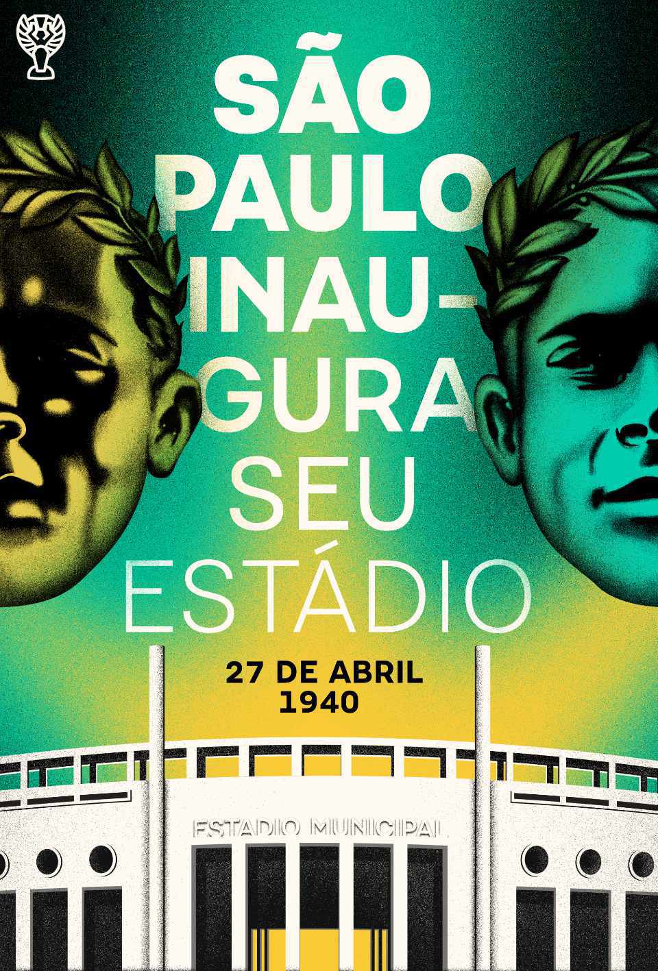
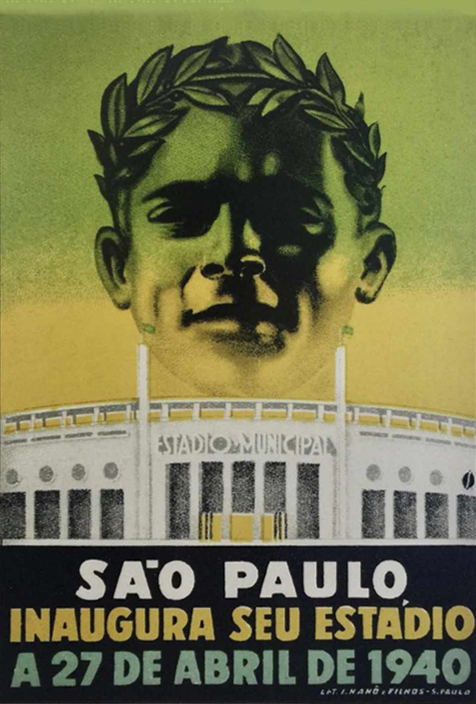
Pacaembu is a sans serif typeface that finds its roots in Brazilian football. This seven weight family began as a study of the stone lettering found in the Paulo Machado de Carvalho Municipal Stadium, affectionately known as the Estádio Pacaembu, a real gem of the Art-Deco style inaugurated in 1940.
- Pelé
- Pacaembu Ultra
- Garrincha
- Pacaembu Black
- Jairzinho
- Pacaembu Bold
- Sócrates
- Pacaembu Regular
- Rivellino
- Pacaembu Medium
- Ronaldo
- Pacaembu Light
- Neymar
- Pacaembu Thin
Seven weights
Pacaembu has a lot of range in a manageable 7 weight family going from Thin to Ultra.
Going for the tittle
In the heavier weights of Pacaembu, the dot of the i and j gets a little too bulky, and to keep possession of the ball the pair have to adjust their tops to better balance it. By the way, this dot is called a tittle.
Counter attack
Not too grotesk, not too deco, Pacaembu sits at a sweet spot between grabbing attention and playing it cool. The Art Deco influence in Pacaembu is mostly in the caps. Notice the large counters of P and A, as well as the high waist of letters like E, M and B.
Build up play
Some of Pacaembu’s characters seem built-up. The exaggerated geometry in glyphs like g, j, ß, 6, 9 and ? can help this font feel more contemporary while still in the spirit of the highly constructed original lettering.
Hand ball
Pacaembu comes packed with 20 manicules, the little hand icons that typographers love. ✋
All equipped with goalkeepers’ gloves so there is no foul. 👌
Subbing in
To keep the squad flexible, Pacaembu comes with a one-storey version of a for when you’re playing friendlies and a two-storey version for championship matches.
We also realize our default version of ? can get a little distracting in text setting so we included a more normal one on the bench.
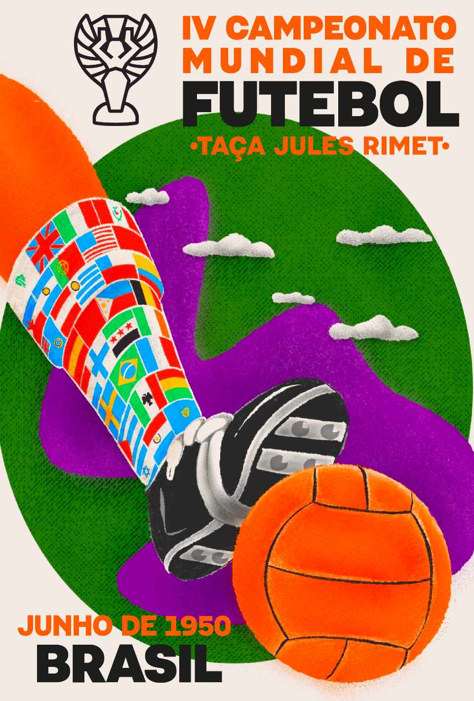
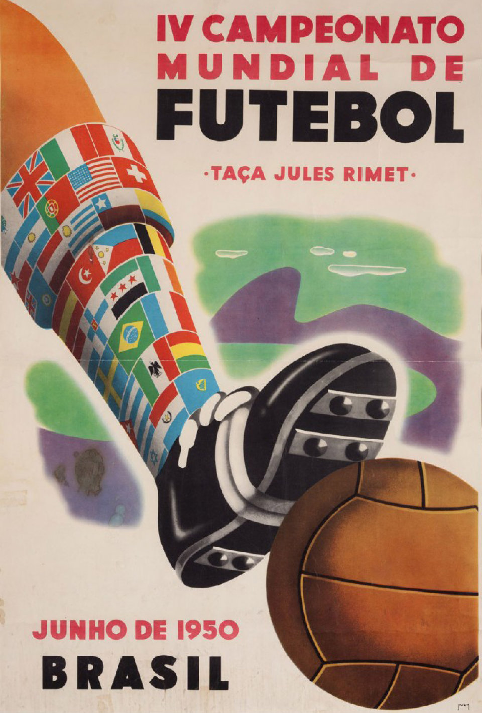
World Cup
In 1950 Brazil hosted the World Cup for the first time, and among the grounds used in the competition was — you guessed it — Pacaembu Stadium.
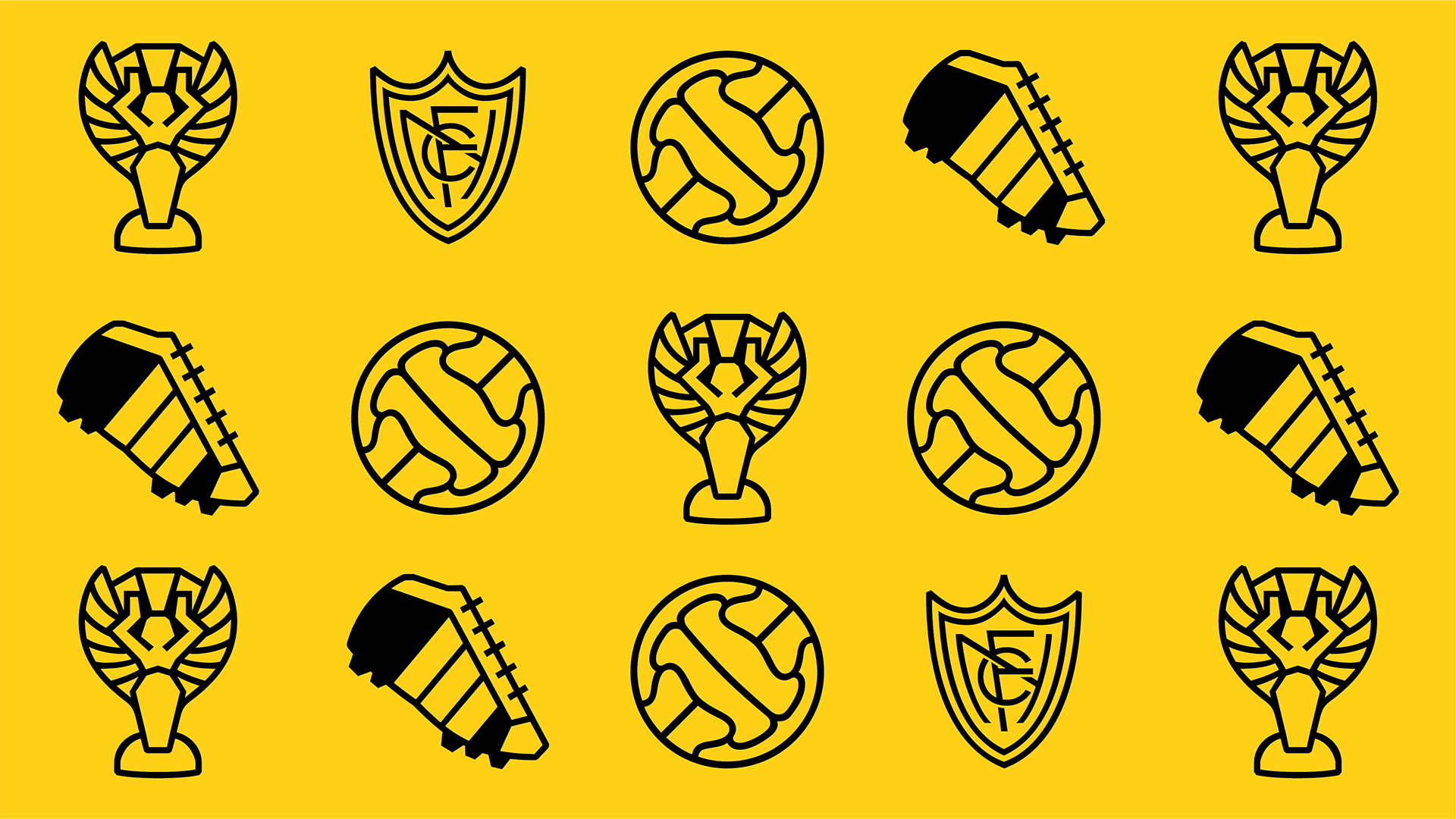
Remembering that landmark moment, the Pacaembu fonts have icons inspired in the ball used in the tournament ⚽ and the 🏆 Jules Rimet Cup, the ultimate prize of that championship. There’s even a 1950’s soccer boot in there too! 👟
Half-time
In Pacaembu you can find all unicode fractions, and even set your own arbitrary ones with our smart fraction feature accessible via OpenType. There are arrows in all directions too, so you can write out FIFA cheat codes. ↑ ↑ ↓ ↓ ← → ← → B A start
Try it on
The whole family costs $250, and if you are unsure you can always try before you buy with our free trial fonts. 👟
Art-Deco World Cup: From Europe to the Tropics
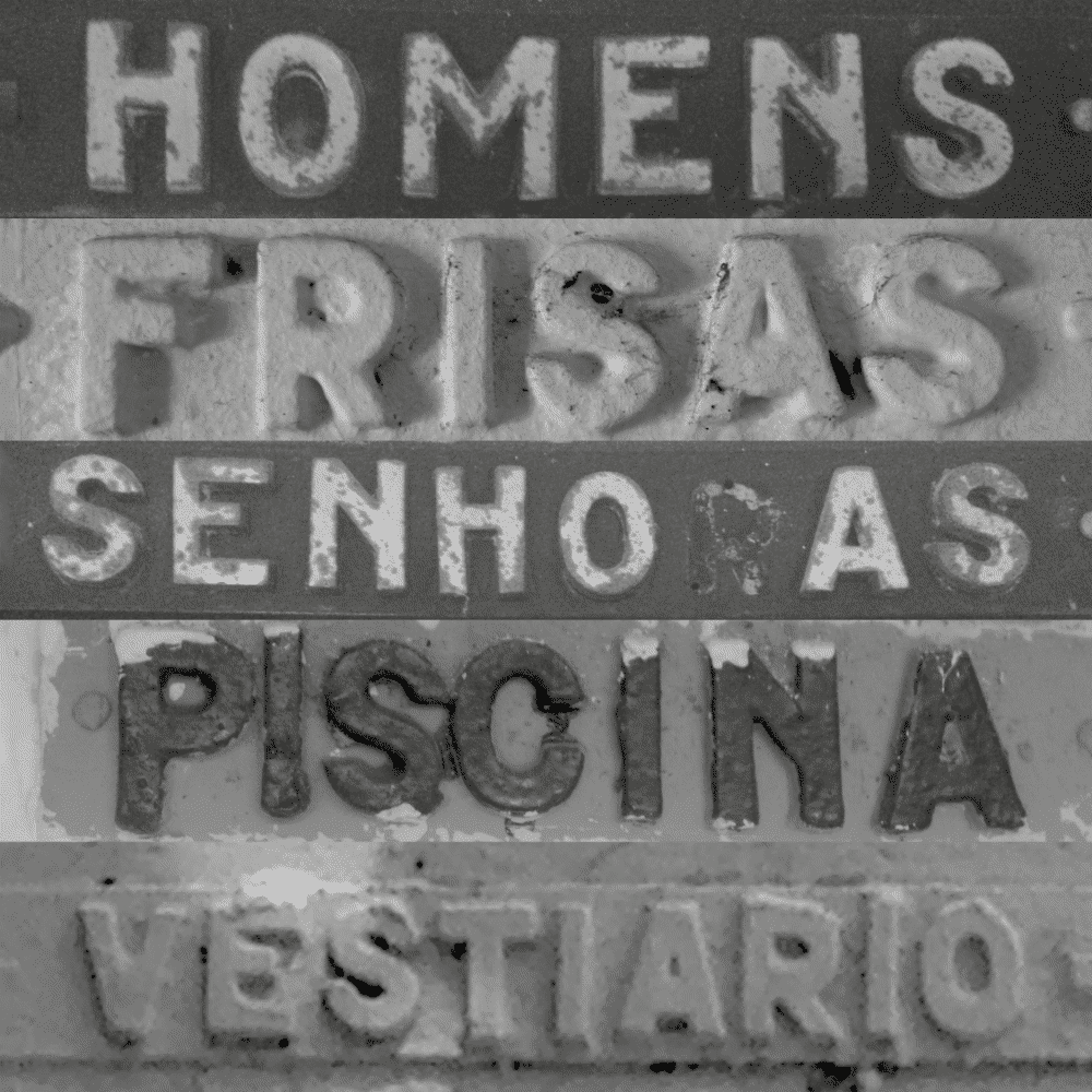
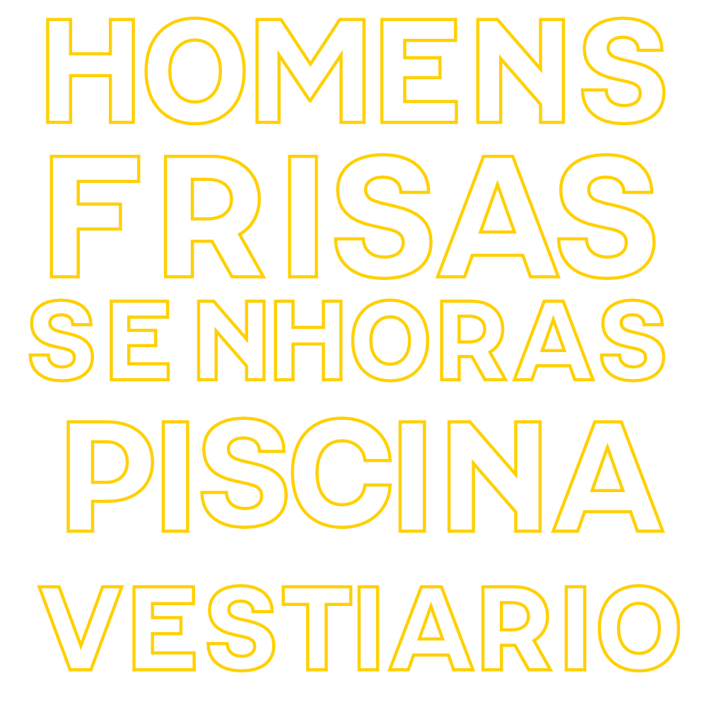
Pacaembu stadium was designed at the Technical Office of Ramos de Azevedo Severo & Villares, in a long process that started as early as 1933. During construction, a lot of great lettering pieces were embedded on the walls to serve as signage. These often-small but never-dull letterforms had a distinct personality: Much less flashy than the stadium’s famous front lettering, but just as filled with Art-Deco goodness.
PhD research from José Roberto D’Elboux at São Paulo University has traced the Art-Deco influence found in the original designs to specific trade-schools in São Paulo, where European draughstmen taught the lettering style to most of the city’s engineers, including of course many of the ones employed at Ramos de Azevedo Severo & Villares.
These art-deco letters, like football itself, were brought to Brazil by Europeans and out there in the tropics found a totally unique personality.
Just like its stadium namesake, our Pacaembu typeface is a celebration of Brazilian Football, its unique flavours, moves, sights and colors which have been delighting fans all over the world for generations.
Naipe gets the call
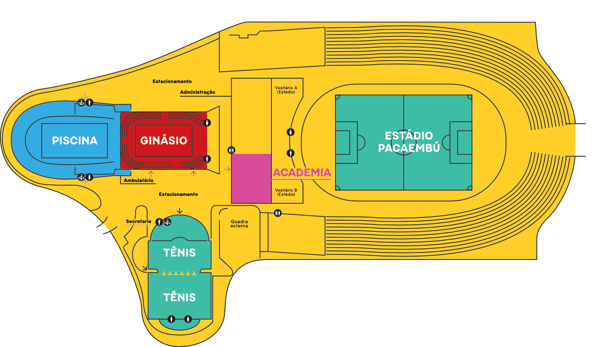
In 2016, Fábio Salmoni invited Naipe to contribute an original typeface to the new wayfinding system he was designing for the public sports complex housed in the stadium.
Fábio realized that the historic signage wasn’t going anywhere and decided that his new wayfinding system needed a font that was able to match its quirkiness, integrate with it and perform well as a wayfinding tool. Over time, Álvaro Franca made visits to the site, took a ton of photos and came up with a first draft which he and Fábio worked on fine-tuning for the wayfinding system.
To be used for wayfinding, Pacaembu needed to be easy to read at a distance and fill just the right amount of space.
This process was very informative, and the constraints really helped shape the design decisions built into the Pacaembu fonts. Sadly, due to unforeseen circumstances the wayfinding project got shelved, so Pacaembu went to sit on the bench for a while.
Extra-time winner
In 2019 Felipe Casaprima joined the foundry and decided to give Pacaembu another shot at glory. This time, the font would divorce from the source material.
What we had before was a bit old-school, so if it was going to be used by designers working in 2020 and beyond it needed a bit of a twist.
The new caps got more ample proportions and rounder rounds, Felipe did a complete re-work of the existing lower-case while he and Álvaro extended the character set to serve more languages and include nice things like icons, arrows and fractions.
The result is a font that sits between the 1940s and the 2020s, built to withstand the harsh reading conditions of wayfinding and stand out when set in all caps.
Pacaembu carries the flare and style of art-deco in just the right amount. It won’t overpower any design or shout at the reader, but it always brings a taste of history to the pitch.
The Stadium
Once the biggest in Latin America, with over 70.000 seats, Pacaembu Stadium was conceived as a meeting place for Paulista society and brought together sport and entertainment, helping foster the urban development of the surrounding area and becoming the symbolic center of Brazilian Football starting in 1940.
Landmark Moments
Pacaembu is such a cornerstone of Brazilian Football it’s incredibly hard to tell the story of this 5-time World Cup winners without it.
The inaugural match between Palestra Itália and Corityba F.C. was the first one ever to be transmitted via Radio in the country. These broadcasts meant that for the first time the passion for football was reaching the farthest corners of this continental country.
Pacaembu hosted six matches of the 1950 World Cup, the first one after competitions stopped during World War II. While Maracanã gets the story of a final Brazilians would rather forget, Pacaembu held a 2×2 draw between the Brazil and Switzerland in the group stages, as well as two matches in the final rounds where Uruguay claimed the points that would take it to Rio de Janeiro, where the Celeste side were crowned champions.
In its 80 years of history Pacaembu was the stage for many defining moments in South American and Brazilian football, hosting the most important championships in the land including four Copa Libertadores da América finals, the 1949 Copa América, 1950 World Cup, the 1963 Pan-American Games, and countless local and national Brazilian Championships. Here are some of the most iconic matches ever played there.

Palestra Italia06 × 02Curityba F.C.
- The first ever match held at the Pacaembu.
- Date:
- Attendance:≈60.000
- Referee:Heitor Marcelino Domingues
- Goals:
- ⚽Zequinha1’
- ⚽⚽⚽Danilo6’36’67’
- ⚽Luizinho56’
- ⚽Elyseo63’
- ⚽Sandro81’
- ⚽Branco87’
- 🏆 Palestra Italia become the first champions of the new stadium

São Paulo F.C.03 × 03Corinthians
- Leonidas da Silva’s first ever match for São Paulo F.C., one of the largest crowds ever to attend Pacaembu.
- Date:
- Attendance:71.281
- Referee:Jorge Gomes de Lima Joreca
- Goals:
- ⚽Jerônimo10’
- ⚽Lola30’
- ⚽⚽Servílio48’88’
- ⚽Luizinho60’
- ⚽Teixeirinha81’

Brazil10 × 01Bolívia
- Brazil trashes Bolivia on its second match of a campaign that would end with Brazil the champion of the Americas.
- Date:
- Attendance:40.221
- Referee:Cyrill Jack Barrick
- Goals:
- ⚽⚽⚽Nininho16’39’86’
- ⚽Jair17’
- ⚽⚽Zizinho25’80’
- ⚽⚽Cláudio49’84’
- ⚽⚽Simão71’79’
- ⚽Ugarte75’
- 🏆 Brazil

Brazil02 × 02Switzerland
- Group stage match at the 1950 World Cup. Nothing much happened in this draw, but Switzerland reminds us of Sans Serifs so it seemed like a match worth mentioning. It’s also the only World Cup match Brazil ever played at Pacaembu.
- Date:
- Attendance:42.032
- Referee:Ramon B. Azon
- Goals:
- ⚽Alfredo3’
- ⚽⚽Faton17’88’
- ⚽Baltasar32’

Palmeiras01 × 01Peñarol
- On the second leg of the Libertadores da América Final Uruguay’s Peñarol held Palmeiras to a draw and became continental champions.
- Date:
- Attendance:50.690
- Referee:José Luis Praddaude
- Goals:
- ⚽Sacia2’
- ⚽Nardo32’
- 🏆 Peñarol

Corinthians01 × 03Palmeiras
- A national final between São Paulo’s fiercest rivals starts it’s first leg with Palmeiras setting a comfortable lead that would take them to the championship.
- Date:
- Attendance:36.409
- Referee:Antônio Pereira da Silva
- Goals:
- ⚽⚽Rivaldo45’63’
- ⚽Edmundo65’
- ⚽Marques67’
- 🏆 Palmeiras

Santos01 × 01Botafogo
- Brazilian League final. In the alvinegro duel, Botafogo uses the advantage of the first leg to become champions for the first time in 27 years.
- Date:
- Attendance:31.488
- Referee:Márcio Rezende de Freitas
- Goals:
- ⚽Túlio24’
- ⚽Marcelo Passos46’
- 🏆 Botafogo

São Caetano01 (2) × (4) 02Olímpia
- Another Brazilian team loses a Libertadores da America final. Despite having the advantage, São Caetano loses in regular time, the match goes to penalties and Olimpia takes the title.
- Date:
- Attendance:32.000
- Referee:Óscar Ruiz
- Goals:
- ⚽Aílton31’
- ⚽Córdoba49’
- ⚽Báez59’
- 🏆 Olímpia

Santos02 × 01Peñarol
- Led by a young Neymar Jr., Santos breaks the curse and wins the Libertadores da América despite scoring an own goal.
- Date:
- Attendance:40.200
- Referee:Sergio Pezotta
- Goals:
- ⚽Neymar46’
- ⚽Danilo68’
- ⚽Durval (on goal)46’
- 🏆 Santos

Corinthians02 × 00Boca Juniors
- Corinthians wins their first ever continental cup by beating Boca Juniors, a day millions of Corinthians fans will never forget.
- Date:
- Attendance:40.186
- Referee:Wilmar Roldán
- Goals:
- ⚽⚽Emerson53’72’
- 🏆 Corinthians
Legends
Because of its widespread use by teams São Paulo, it’s no surprise to learn that the green grass of Pacaembu stadium has been stepped on by some of the best players ever to grace the sport.
From Pelé to Neymar by way of Zico, Rivellino, and Ronaldinho there isn’t a single Brazilian superstar that didn’t play at the Pacaembu.
Even legends like Messi, Suaréz and Maradona have also passed by at least once.
It would be impossible to list them all, so Naipe made an all-brazilian selection of some of the most iconic footballers ever to bring their skills to Pacaembu’s pitch.

Leônidas da Silva
Career: 1930 – 1950
Credited with inventing the Bicycle Kick in 1932, he drew one of the largest crowds Pacaembu has ever seen in his first game for São Paulo F.C.
- 👟 Appearances: 291
- ⚽ Goals: 230
- 🏆 Honours:
- Invented the Bicycle Kick
- FIFA World Cup Golden Boot (1938)
- FIFA World Cup Golden Ball (1938)
Classic line-ups
- 11TeixeirinhaForward🇧🇷 São Paulo F.C.
- 10RemoForward🇧🇷 São Paulo F.C.
- 9Leônidas da Silva👟Forward🇧🇷 São Paulo F.C.
- 8Antônio SastreForward🇧🇷 São Paulo F.C.
- 7LuizinhoCForward🇧🇷 São Paulo F.C.
- 6NoronhaMidfielder🇧🇷 São Paulo F.C.
- 5BauerMidfielder🇧🇷 São Paulo F.C.
- 4RuyMidfielder🇧🇷 São Paulo F.C.
- 3Armando RenganeschiDefender🇧🇷 São Paulo F.C.
- 2PiolimDefender🇧🇷 São Paulo F.C.
- 1Gijo🤚Goalkeeper🇧🇷 São Paulo F.C.
- Coach: Jorge Gomes de Lima "Joreca"
- 1🤚Gijo
- 2Piolim
- 3Armando Renganeschi
- 4Ruy
- 5Bauer
- 6Noronha
- 7Luizinho
- 8Antônio Sastre
- 9👟Leônidas da Silva
- 10Remo
- 11Teixeirinha

Championship standings
Data provided by football-data.org


Naipe F.C.
Under the name of Naipe Foundry, the carioca duo of Álvaro Franca and Felipe Casaprima tell Brazilian stories by designing fonts fit for your next design project.
The two support rival clubs in Rio de Janeiro, but their combined love of fonts and football is enough to bridge this rivalry and bring you Pacaembu, our all time leading goal scorer.
Thank you!
Cadu Carvalho for building and designing this website, for believing in every stupid idea we pitched and making them much better than we could imagine.
José Roberto D’Elboux, Lédio Carmona, Jonas Decorte and Fabio Salmoni for creating the research that so eloquently informed the design of Pacaembu and the content of this website.
Raffa Marques of Mowe Studios, for animating the main features of the font and our portraits.
Paula Cruz for the player illustrations and for making portraits that make us seem handsome.
Ivan Bezerra, Léo Santana, Linus Lohoff, for the beautiful artwork on our specimen section.
Alex Foxley for animating our Art-Deco postcard and proofreading this website.
Daniel Castrillón, for recreating the stadium inauguration poster and Ana Franco Netto for recreating the 1950 World Cup poster.
Travis Kochel, Lizy Gershenzon and the entire Future Fonts Family for creating the environment that allowed Naipe and this project to flourish.
Our customers for supporting our work.
Wikimedia and Hemeroteca Digital Brasileira for being wonderful sources of public domain images.